Rental surfaces often make an otherwise good room feel unfinished: a bland backsplash, a damaged-looking vanity, builder-white shelves, or one wall that never quite joins the furniture. Peel-and-stick products promise a fix without renovation, but the wrong finish can look more temporary than the surface it covers. Worse, “removable” is not a guarantee that old paint, damp drywall, or heat-exposed adhesive will survive.
The useful strategy is not to wrap everything. Choose one contained surface, match the material to the conditions, and order samples. Matte finishes, believable scale, and clean edges matter more than a dramatic pattern. Check your lease, photograph the original surface, and test a hidden spot for at least a week.
Start with the surface, not the pattern
Run a clean hand across the target area. Flat, sealed, smooth surfaces are the best candidates. Skip flaking paint, fresh paint that has not fully cured, rough orange-peel texture, loose grout, swollen cabinet edges, or anything that feels damp. Clean with the product maker’s recommended method and let the surface dry completely. Do not improvise with a strong degreaser unless the instructions permit it; residue can weaken adhesion.
Buy one production run, plus roughly ten percent for errors. Ask: Does the print convince from across the room? Does the sheen change under lamps? Can you reposition it without stretching? Does slow removal lift paint? A full roll will not fix a bad sample.
12 upgrades worth considering
1. Matte wallpaper on one short wall
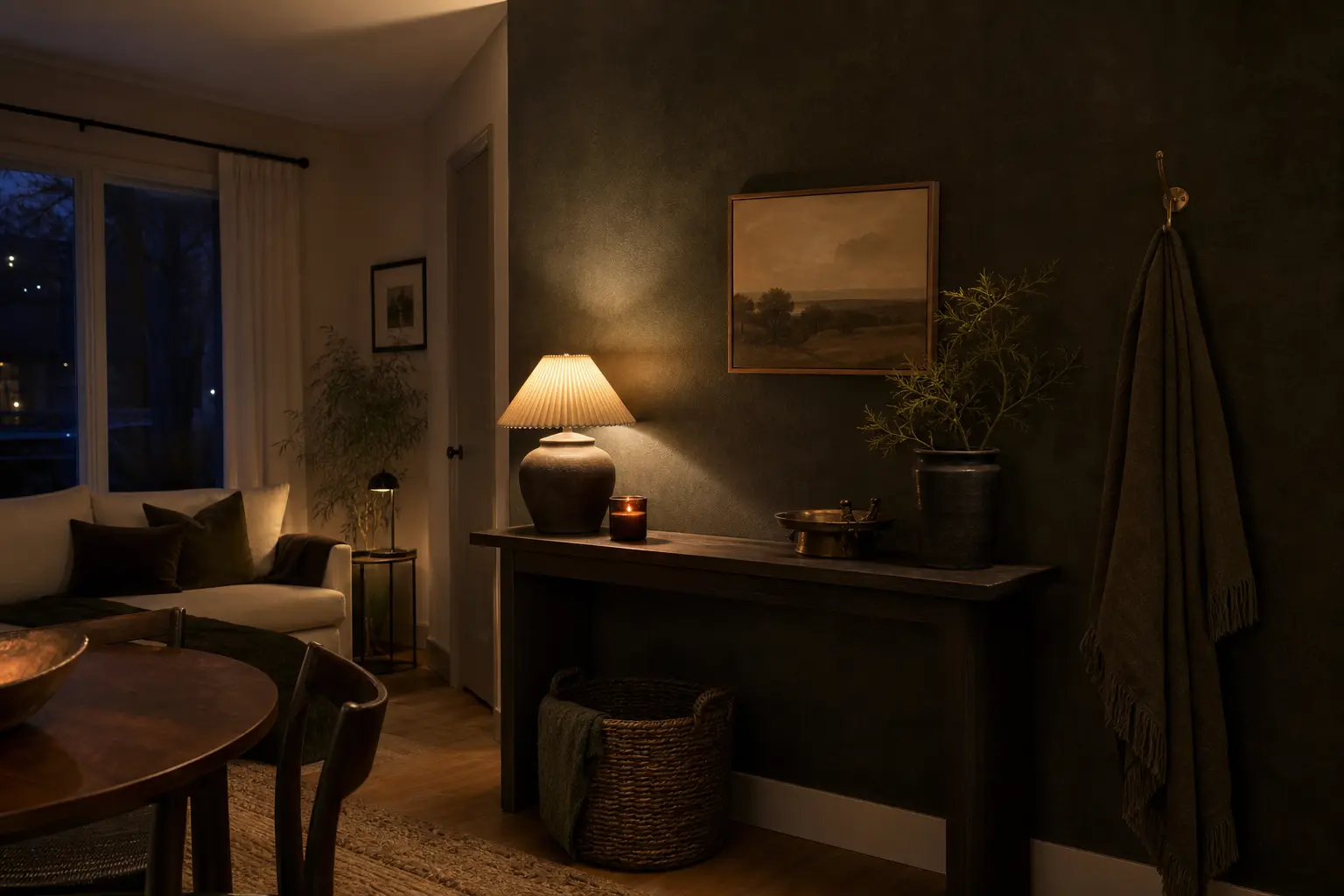
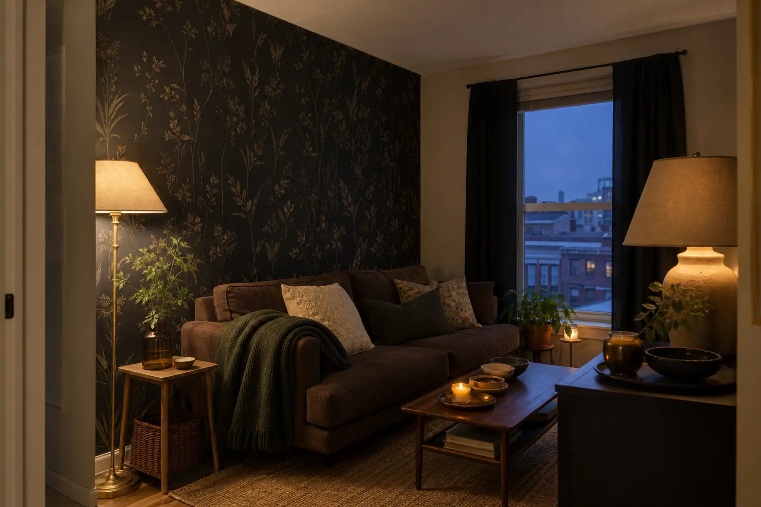
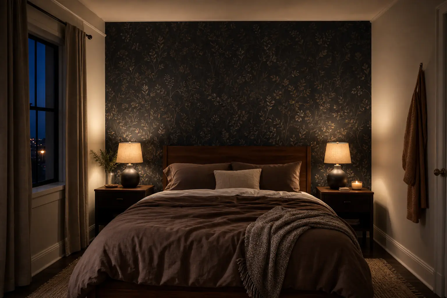
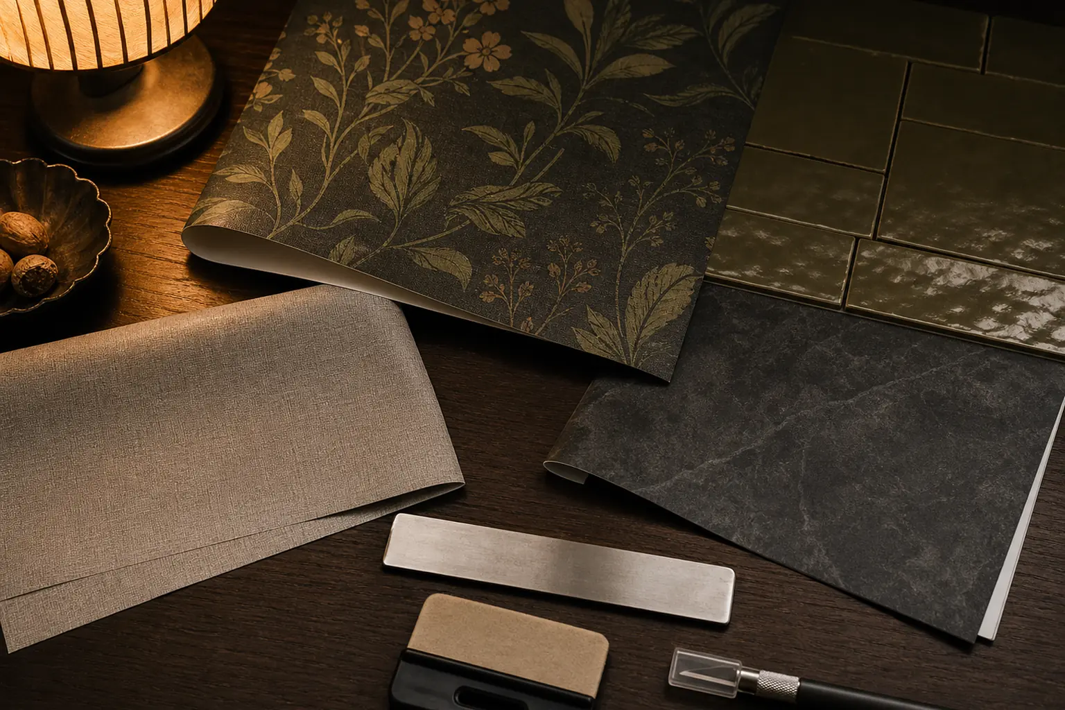
Use removable wallpaper where the wall has a natural stopping point: behind a bed, inside an entry nook, or between two corners. Small-scale patterns and low-contrast botanicals are easier to align and live with than giant faux murals. Choose matte or lightly textured paper; glossy vinyl reflects every lamp and makes seams obvious. For a dark room, a charcoal, tobacco, moss, or muted plum field gives depth without demanding that every accessory match.
2. Wallpaper inside a shallow alcove
An alcove, open closet back, or built-in desk recess needs less material and hides slight edge variation. Measure at three heights because rental walls are rarely square. Cut each panel a little long, align at eye level, then trim with a fresh blade against a wide metal edge. This is one of the lowest-cost ways to make a forgotten recess look intentional.
3. Linen-look contact paper on open shelf backs
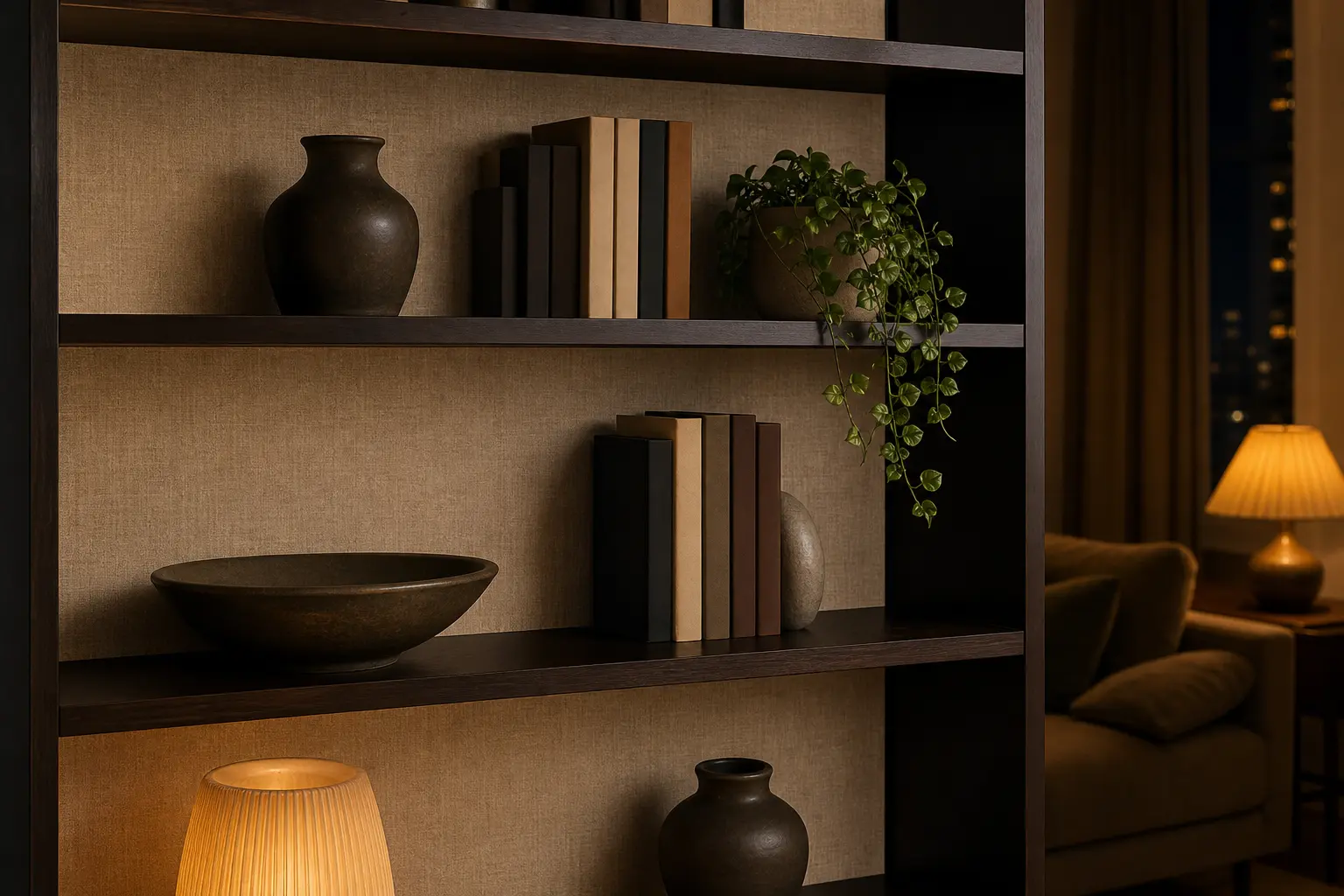
Contact paper works best when it imitates a quiet material rather than rare marble. A woven-look taupe, deep olive, or warm black backing creates contrast. Apply it to a removable hardboard insert when possible; the insert protects the landlord’s finish and can move with you.
4. Solid-color film on a tired vanity front
For a bathroom vanity with flat slab doors, a solid architectural color can look cleaner than faux woodgrain. Remove knobs, wrap only intact faces, and keep seams away from sink splashes. Do not cover swollen particleboard or peeling laminate; film will emphasize the damage and may trap moisture. Reinstall the original hardware before move-out and keep every screw in a labeled bag.
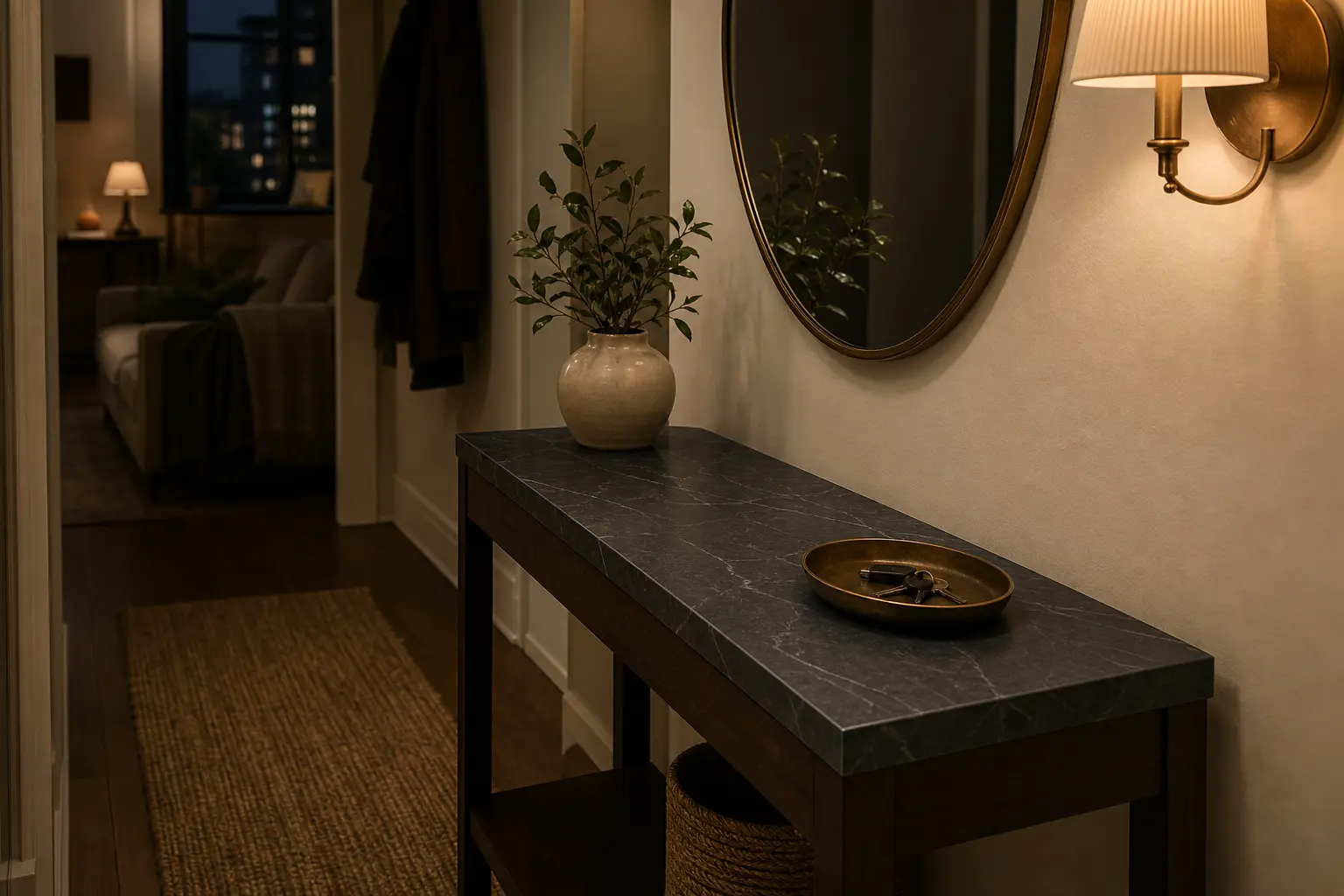
5. Stone-look film on a dry console top
A small console top is safer than a kitchen counter. Choose restrained veining and a satin finish, then wrap the visible edge. Avoid cutting on it, setting down hot tools, or using it around a sink. A convincing two-foot surface can work; twenty feet of repeating “marble” usually cannot.
6. Peel-and-stick backsplash tile with real depth
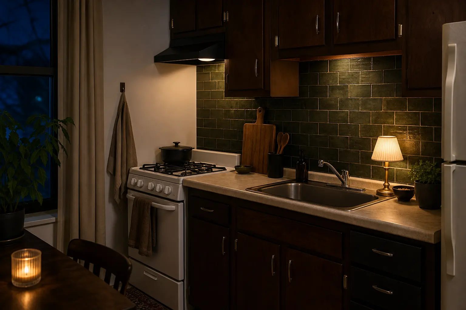
Choose tiles with beveled edges, varied tone, and a scale close to ceramic—not a printed sheet pretending to have grout. Lay the entire composition on the floor first so cuts fall at the ends. Keep it away from open flame and follow the maker’s stove-clearance guidance. Around sinks, moisture can work into an unfinished edge, so finish boundaries cleanly and inspect them periodically.
7. Large backsplash panels for fewer seams
Panels suit a short run behind a coffee station or dry counter because fewer joints reduce visual noise. Thin metal-look, fluted, or muted stone panels can read more convincingly than tiny mosaics. Confirm that the panel can be removed from your exact wall finish. If the adhesive is aggressive, mount panels to thin removable backing and secure that backing only where your lease allows.
8. Floor decals in a tiny, low-traffic zone
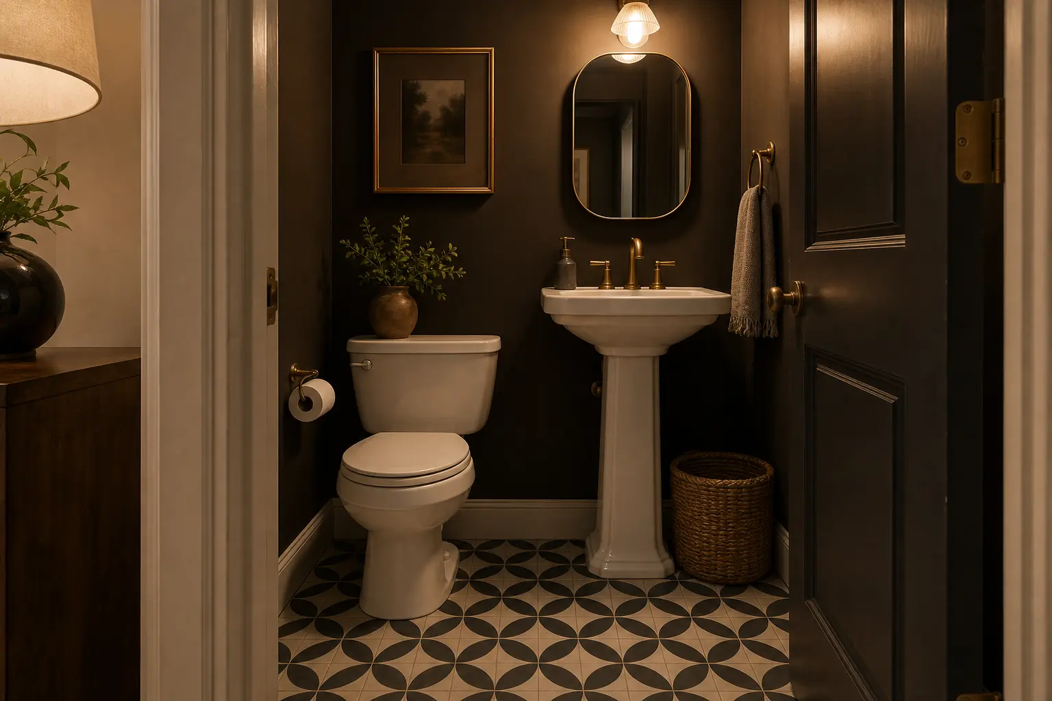
A small powder room or enclosed laundry nook is a better candidate than the main kitchen. Use a medium-scale geometric pattern that can tolerate slightly imperfect grout lines. Clean the existing tile thoroughly, plan from the visual center, and trim each decal instead of forcing it over raised grout. Expect wear near door swings; buy spares from the same batch.
9. A removable fireplace surround accent
Only use an adhesive product near a fireplace if the fireplace is decorative or the product is explicitly rated for the temperatures and clearances involved. In many rentals, the smarter move is a temporary insert or freestanding screen rather than adhesive near heat. A dark slate-look accent can anchor a nonworking surround, but safety and lease rules outrank appearance.
10. Adhesive trim around a plain mirror
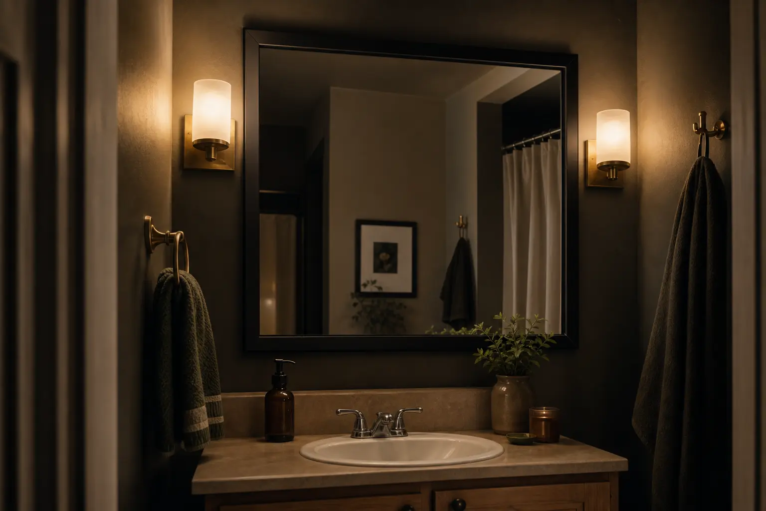
Thin, lightweight trim can give a clipped builder mirror a finished edge without replacing it. Matte black, aged brass, or paintable wood-look profiles are easier to integrate than ornate metallic foam. Check that the mirror has enough clearance and that removal will not pull the reflective backing. For the lowest-risk method, build a lightweight frame that rests around—not on—the mirror.
11. Adhesive cable raceways painted to disappear
Cord covers are practical peel-and-stick upgrades, especially when you are also improving the room with warm plug-in lighting. Pick the shortest safe route to the outlet, avoid creating a trip edge, and use a cover sized for the actual cable. Paint only if the product allows it—and use a separately painted removable sample to avoid matching paint directly on the wall.
12. Removable hooks arranged like hardware
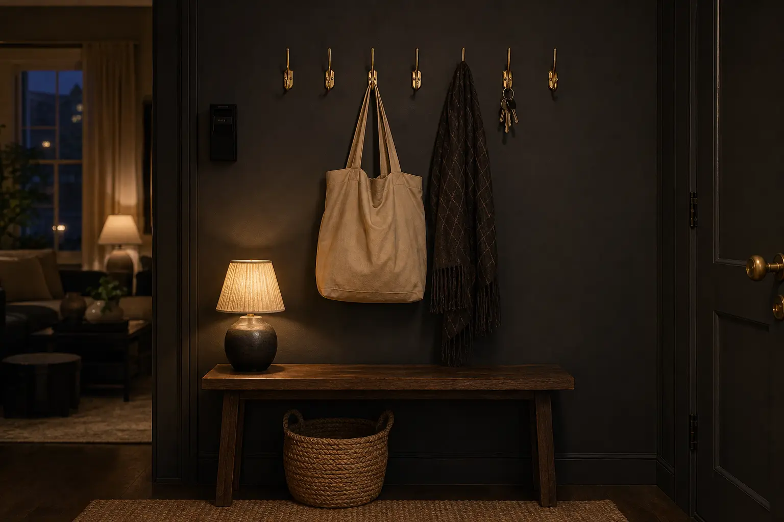
Hooks look more permanent when aligned as a considered rail rather than scattered wherever an item landed. Use identical hooks, level their centers, and leave enough negative space for coats or bags. The package weight limit is a ceiling under approved conditions, not a challenge. Textured walls, humidity, dirty paint, and sideways pulling all reduce reliability.
The cheap-looking mistakes to avoid
- Too much imitation: faux marble beside faux wood beside faux tile makes each material less believable.
- Visible raw edges: stop at corners, trim carefully, and do not leave a thin line of the original finish showing.
- Bad scale: oversize veining and tiny brick patterns reveal that the material is printed.
- Ignoring the light: inspect samples under daylight and your evening lamps; sheen can change completely.
- Trusting “removable” blindly: adhesive performance depends on the substrate, paint age, heat, humidity, preparation, and removal technique.
Remove it as carefully as you installed it
Keep the packaging and instructions. When move-out approaches, test removal in a low corner before working across the surface. Go slowly at the angle and temperature the manufacturer recommends; do not yank material straight away from the wall. Stop if paint begins to lift. Residue should be treated only with a cleaner approved for the original finish, and any backing panel or saved hardware should be restored exactly.
The finished-rental rule: one matte, well-bounded upgrade is more convincing—and safer—than an apartment wrapped in adhesive. For more deposit-conscious methods, see the no-damage curtain and lighting guide, browse all renter upgrades, or return to the complete article library.